Contens
The motivation is of course that there is an abundance of image datasets, just waiting to be visualized. Unfortunately, if you do not have labels available, it’s not possible to easily get a good visualization. Currently you can try to take a pretrained network and visualize the high-dimensional activations with t-SNE or UMAP (or any other neighbor visualization).
So, what are the issues with this approach? It’s not a parametric approach and as such it is not possible to embed new points into the embedding easily.¹ While the pretrained network does not rely on labels anymore, it did during training, which does influence the final embedding. Furthermore, t-SNE and the likes come with their own biases when visualizing the data, which needs to be accounted for (Böhm et al, 2022).
Method
Our approach is inspired by both neighbor visualizations as well as SimCLR (Chen et al., 2020). The idea of visualizing a graph via Cauchy similarities stems from t-SNE, while the implicit graph structure is implied by SimCLR. Combining those two ideas leads to our algorithm t-SimCNE.
Definition: neighbor embedding
A low-dimensional visualization where the neighborhood for all given points is optimized. If two points are close to each other (are neighbors) in the high-dimensional input space, they should also be close in the final embedding.
Instead of having a neighbor graph that we want to visualize, we instead have an augmentation graph. This is not a real graph in itself, but rather we construct an edge in this graph by augmenting the same image twice.

The substitution of the neighbor graph with the augmentation graph is the central piece of our work. Since the neighbor graph for images is not very informative (in pixel space), the augmentations give us a much better idea of which properties are worth preserving in the 2D output space. In this sense, we now say that the neighbor relation is defined by the augmentation, instead of proximity in the input space. (This is not a perfect analogy since the augmentations operate on the same image, so the vertices the edge is attached to are ephemeral unlike the in the neighbor embedding setting.)
SimCLR uses a cosine affinity kernel by default , which we replace it with a Cauchy kernel . The cosine affinity is high when the angle between two points is low, while the Cauchy kernel is high when the Euclidean distance between two points is low. For a visualization task the Euclidean distance intuitively makes sense, whereas the cosine affinity is hard to get a good feeling for in 2D.
And finally, just optimizing the network to map directly to two dimensions results in a suboptimal visualization. We found that it is better to first pretrain the network in 128D and then continue training in 2D afterwards.
The method can be boiled down to three new insights:
- We can reinterpret the data augmentations as a form of neighbor graph that we can sample from.
- We can use a different kernel for SimCLR in order to facilitate a better visual interpretation.
- We come up with a training strategy that will give us an end-to-end visualization method.
Results
The results are quite satisfying! On CIFAR-10 we get a nice separation between the classes and also find subcluser structure.

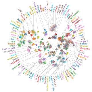
For the CIFAR-100 dataset we can see that quite a few classes are grouped into their respective superclasses. Unfortunately, the analysis here is a bit harder as the dataset is more complex. However, our approach is able to compete with much larger pretrained ResNets in terms of classification accuracy.

Discussion
The method is quite new and it’s interesting to see new datasets being visualized. We’re looking into ways to further improve t-SimCNE as the method does not yet really produce satisfying results on e. g. Tiny ImageNet (but we do have an idea that looks promising).
Due to it being born out of research, the training takes quite a bit of time. While the method has seen some performance improvements, so far it is easily outsped by the more traditional tools that are used for visualization. This is mostly because training the ResNet in a contrastive way takes quite some time due to the quadratic compute burden with respect to the batch size.
We’re trying to come up with better methods in this domain, so hopefully this will also improve in the future. For now you can check out the code.
And finally, to read the full details, including many more figures, see the paper.
Footnotes
- There are parametric versions of both t-SNE (van der Maaten, 2009) and UMAP (Sainburg et al., 2021), but they are not as frequently used and also take more time to train. ↩